Branding
mistika
Mistika is a company with over 50 years of combined expertise in the realms of show production, entertainment curation, and cultural experiences.
Our journey with Mistika began with a series of brand strategy workshops, we we developed the foundational pillars of the brand. These encompassing brand statements then became the informants for building a brand identity that adequately represents Mistaka’s core values.
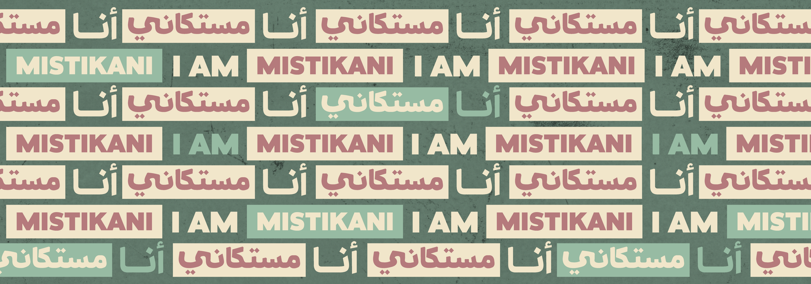
In collaboration with our client, we orchestrated brand naming workshops where we funnelled through multiple rounds of brand names until we landed on one that beautifully represents the brand. It pays homage to the Arabic word for mastic – a substance cherished for millennia, much like the cultural value Mistika embodies and celebrates. This name also symbolises how mastic is an ingredient that is used in multiple mediums and creative expressions – reflective of Mistake’s ability to cater to a wide variety of creative fronts.
Designing the Mistika logo and its accompanying design system was an exhilarating creative journey. We didn’t just design a logo; we crafted a symbol. The symbolic essence of Mistika is seen in the Arabic calligraphic “diamond like” dot. This cultural shape, utilised in folklore patterns and a dash of retro flair, was our main “magical ingredient” in developing Mistika’s design system and graphical language.

